Framer
Sumatra's native Framer integration lets you create your variants in the same design tool you use to create your site, giving you maximum control over the content and styling of experiences.
Component-based testing
The Framer integration uses Framer components, and their native support for variants, as the foundation for experimentation and personalization.
Create variants
In Framer, identify the component you want to test and double-click to bring up the component editor.
If the element you want to edit is not yet a true component, right-click and choose Create Component.
Now create a new variant (or Duplicate), then change the content and formatting as desired.

Name the variants
Sumatra identifies variants in Framer using layer names. The name of a variant in Framer must contain the exact slug (i.e. variant ID) from Sumatra Optimize.
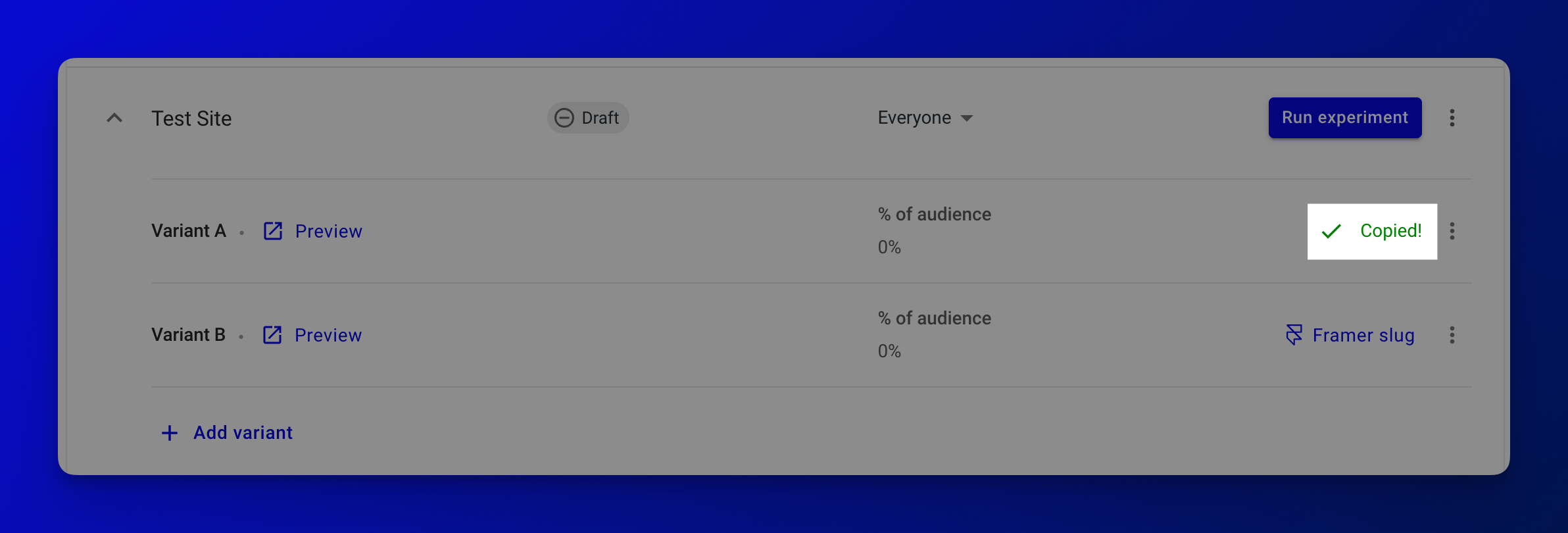
In Sumatra, go to your Optimization and expand the Experience for your experiment. Click Framer slug next to the desired variant to copy the slug to your clipboard.
Now back in Framer, paste the slug as the corresponding layer name.
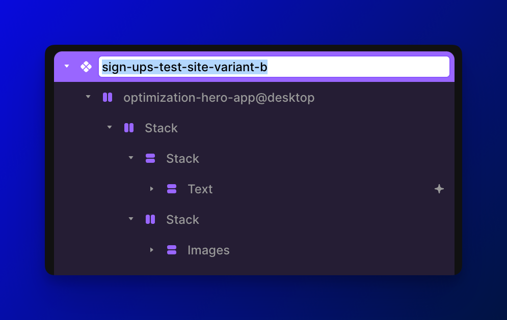
The layer name must only contain the slug, so you are free to add text around it. For example,
a valid name might be My sign-ups-hero-variant-b Button.
Further, if you want multiple test variants to trigger the same component variant, add all
slugs to the layer name, e.g. sign-ups-hero-variant-b newsletter-hero-vip.
Apply code override
In Framer, leave the variant editor and go back to the page that contains the component. Select the component. In the Code Overrides section select SumatraOptimize to apply the override to the component.
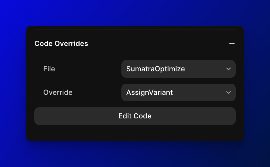
For the Override, select AssignVariant.
If you ever need to find all components with the override attached, click the ... menu next to your SumatraOptimize.tsx asset and choose Find.
All that's left is to activate the experience in Sumatra to see it live. 🚀
Breakpoints
Breakpoints in Framer let you to create responsive designs that adapt to different screen sizes, so your design looks great on any device.
Although Framer now promotes Stack Variables to change styles across breakpoints, Component Variants remain the most common solution, typically one for each of Desktop, Tablet, and Phone
Variants with breakpoints
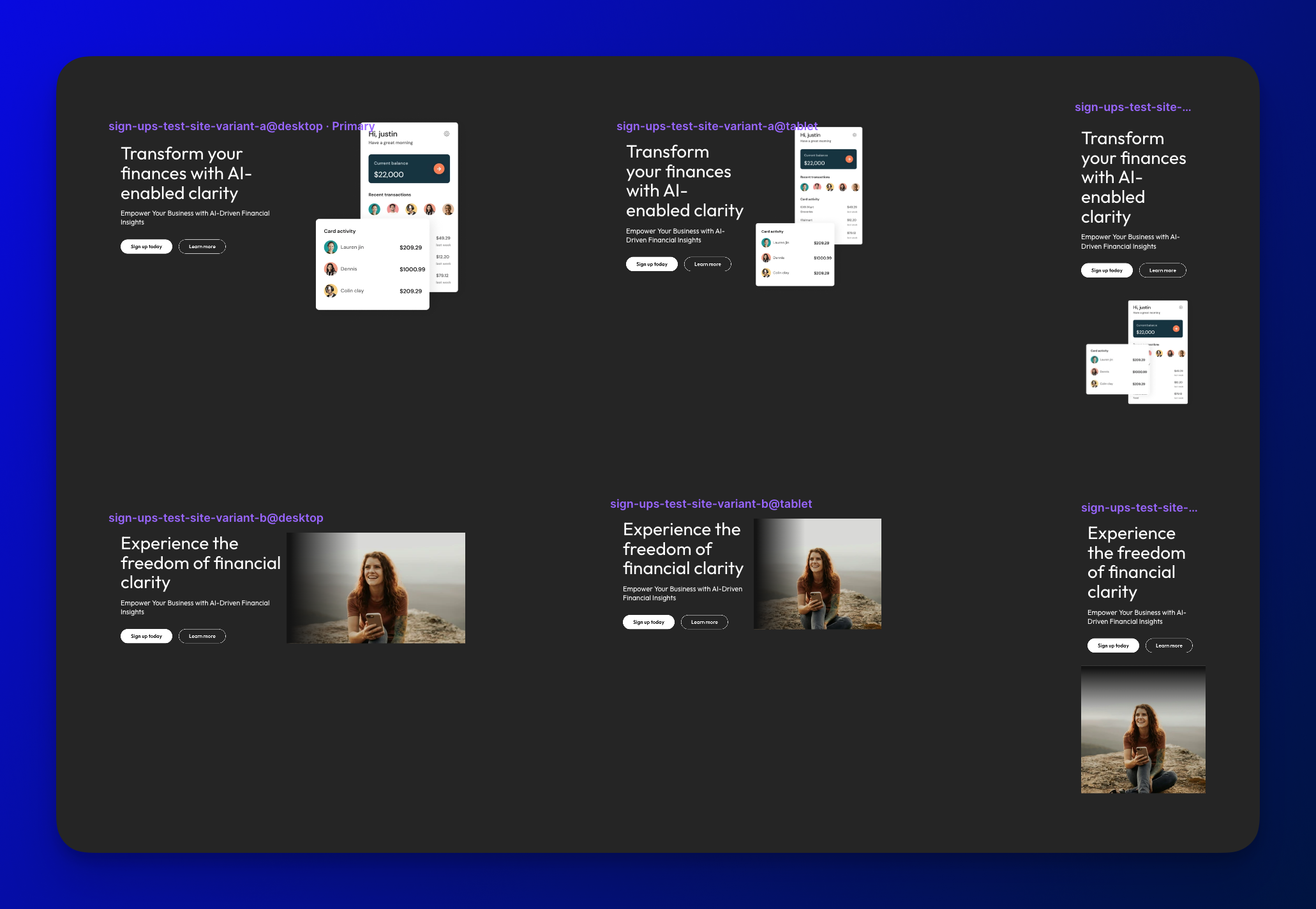
To implement test variants that are responsive across breakpoints, we need to create one Framer variant per test variant per breakpoint.
For example, if we have 2 test variants and 3 breakpoints, we need to create a total of 2 x 3 = 6 component variants:
Naming variants
As before, test variants are linked to component variants by copy-pasting the slug into the layer name.
But this time, we include an additional breakpoint directive, e.g. @desktop, @tablet, @phone.
So your final variant list may look something like this:
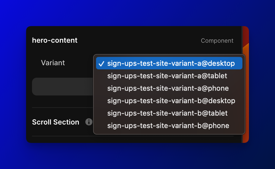
These specific strings are the convention, but you may choose any name you'd like following the @, such as @extra-large.
Also, by convention they are suffixes at the end of the name, but they may appear anywhere, such as in @phone sign-ups-hero-freedom.
Linking��
Breakpoints are not associated with any particular directive names, i.e. there is nothing special about the name @desktop or @mobile.
Instead, by selecting a variant with an @ directive as the default variant for a particular breakpoint, the directive name and the breakpoint become linked to one another.
In the Tablet breakpoint, for my component, I select sign-ups-hero-freedom@tablet from
the Variant dropdown, displaying that option in the Framer preview.
In doing so, the @tablet directive is now linked to the Tablet breakpoint.
Once configured correctly, you should see consistent, responsive components via Preview links. 🚀
Effects
One of Framer's most delightful features is its terrific support for transition Effects.
Effects are not only supported in the Sumatra integration, they are encouraged—as the best practice to achieve flicker-free content swaps above the fold.
Without effects, the component will change its opacity from 0% to 100% immediately after the 300ms or so it takes for Sumatra to fetch variant assignments.
Bottom line: If you're using Sumatra on a component that appears at the very top of a page, you will achieve the best visual result by adding a graceful Appear Effect to the component.